Point of view
»Anti« as the new standard?
5 min read
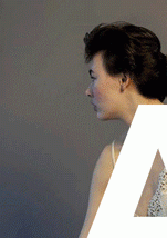
In a world that is driven by the future instead of the present, we are constantly searching for ways to express ourselves through new, unique and as individual as possible forms of creativity. Forms which, in the end, are often interpreted – quite easily and somehow negatively – as anti. But what does anti really mean in a world where the word somehow already seems to have become so standardised?
In a world that is driven by the future instead of the present, we are constantly searching for ways to express ourselves through new, unique and as individual as possible forms of creativity. Forms which, in the end, are often interpreted – quite easily and somehow negatively – as anti. Against. Different.
But then what does anti actually mean if our most successful pop(-ular) star suddenly drops an album called »Anti« that will hit the Billboard Charts in the next week? An album that will probably again soon be one of the most pleasing and mainstream-accepted music albums. Rihanna took to social media to explain its meaning: »By continuing to follow her own instincts, her work strives to make an impact by doing the very antithesis of what the public expects.«
Ironically our definition of anti almost feels like the antithesis of anti itself nowadays: Don’t follow the trend. Be yourself. Be true to yourself. No other proclamations and options of self-expression have been more leading and trendsetting in recent years.
But what does anti really mean in a world where the word somehow already seems to have become so standardised?
Looking at photography, you almost get the feeling that the widespread censorship of photos – something being too risky, too different, too dirty or too anti – is intervening in our present photo aesthetic, predominantly the digital one. Laughing smileys and hearts replace body parts, destroying the picture and its understanding. The cute pictograms have become part and parcel of our digital vernacular. Since the rise of social media apps and the simultaneous lockdown on »inappropriate« content, however, emojis have also come to serve a different purpose. It's the antithesis of expression, of being yourself – censorship.
We seem to be afraid to show in a 1080x1080-pixel miniature Instagram image or on a magazine cover what Helmut Newton showcased in the 70s in large format prints. And yet, we still believe we are more provocative than ever before.
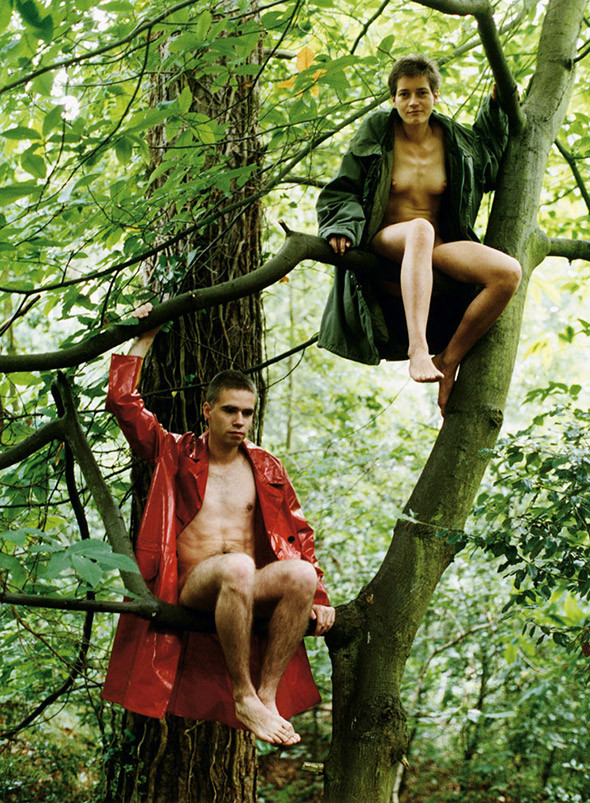
So, what is actually out there that makes us still believe in the existence of the anti? The different? The new?
Decades ago, artists and photographers such as Wolfgang Tilmans and Jürgen Teller started what has now became a visual guideline and counterpart to the antique view on beauty and prettiness in fashion photographs for a new generation. They showed us visually that there was something still to discover that had the potential to be an antithesis of the existing. And by the time Vivienne Westwood commissioned Teller for her campaigns, we had gotten curious.
Meanwhile, entire magazines came up with or even changed their existing identities in order to push towards a different way of looking at things and interpreting fashion and beyond. Complete editorials and layouts follow a new wave of Arial Bold and »consciously mistaken« fashion shots in praise of new forms of aesthetic. Eyes half closed, legs too spread. Everything sort of misplaced or, just real?
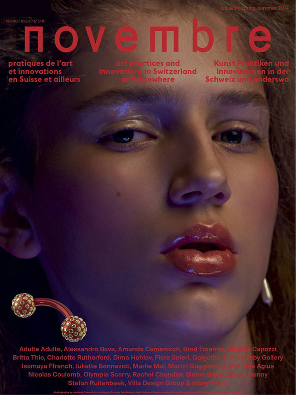
You can love it or hate it but that’s not really the point here. Curiosity is the goal. Magazines such as the Swiss French »novembre« seem to be as anti and as good as it can get by today’s standards. Even if there hasn’t been a new issue for almost one and a half years now, it has still left a remarkable impact on style and design in the industry. The magazine itself describes its intentions and concept as »While proposing intergenerational discussions that explore the power structures in which images and technology occupy decidedly ambiguous positions, we like to nurture the emerging, the outsiders, the arrivistes, the ugly, the dirty, the failed, the exaggerated and honestly wonder about the today’s definition of »bad taste«.«
When a magazine like »novembre« is printed as high-gloss as possible with highly intellectual content, the question of »bad taste« seems somehow to move automatically closer to the idea of a new understanding of beauty and aesthetics. Reality in publications like »novembre« feels a little more present and starts to replace the surreality of wrong body images or hyperactive post-production.
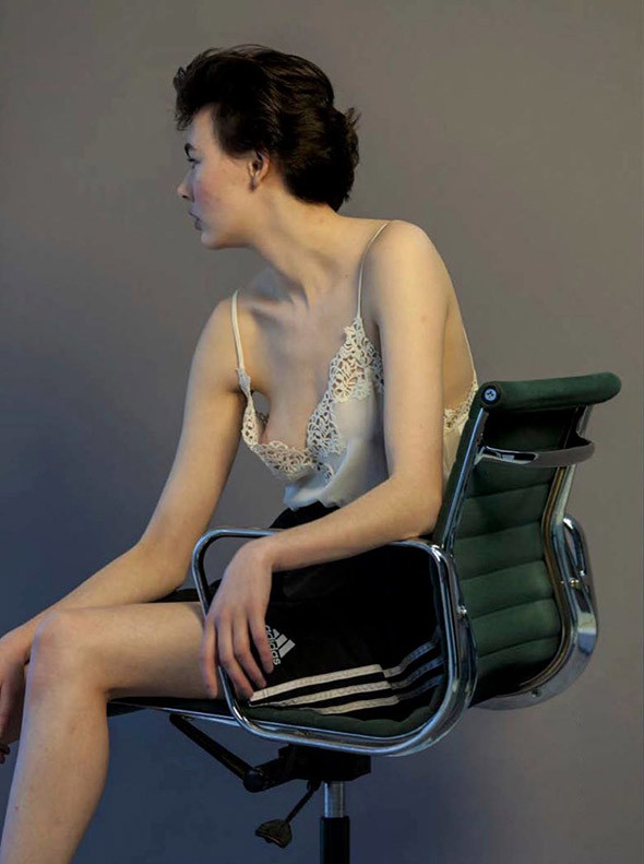
Added to this, photographers of this new generation such as German-born Till Janz or English newcomer Harley Weir are cautiously starting to showcase a new direction and interpretation of fashion photography through their lenses. They seem to be reinterpreting the golden-cut on their terms and have made conscious new decisions to show us as truly beautiful as we are, rather than as we would like to be. What our sleek mainstream fashion mind paradoxically seems to interpret as anti turns out in the end to be just a bit more real and less fantastic.
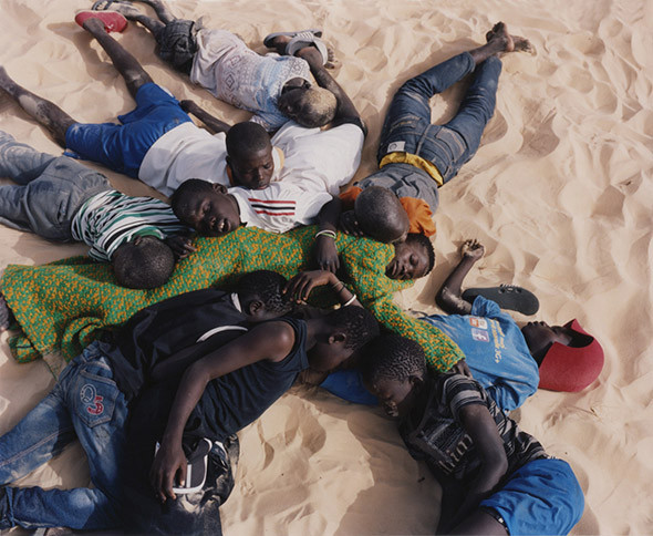
Harley Weir in her own terms is another example of a promising, open-minded polymath, and she might already be the most successful one of her generation at the age of just 26. The reality in her work is omnipresent in the content of the image itself. It’s intelligent and interesting. Something goes beyond the surface in her images. In one of her latest fashion editorials she shot life and faces on the streets of Dakar, documenting instead of staging: Reality rather than a dream.
Examples like these, from publishing companies to individual photographers, show us that it might be time to retrain our trendy eyes and re-educate our stylish minds. The new credo for now could be: When it gets as real as possible, we might just be as anti as possible. As new as possible.
(And in Rihanna’s case: The New York Times title today: »Anti« sells fewer than 1,000 copies (…) Her lowest debut position. So perhaps the title of this article right here will be changed at some point. Which wouldn’t be the worst thing after all.)
By Inga Liningaan Langkay
Book review / Interview
Horst Diekgerdes
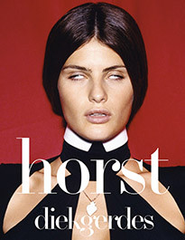
German-born Horst Diekgerdes is one of the country’s most renowned fashion photographers, whose obscure, surprising and surreal images have been part of iconic ad campaigns and major magazines alike, from Dazed & Confused and Vogue to Miu Miu and Hermès. He recently teamed up with Swiss art director Beda Achermann, a friend and long-time collaborator, to publish his very first retrospective monograph.
But what does anti really mean in a world where the word somehow already seems to have become so standardised?
INTERVIEW
Rankin »Less is More«
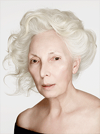
This December Kunsthalle Rostock puts on a fascinating and rather surprising solo exhibition featuring a selection of works by British photography star and publishing big-shot Rankin. While the Dazed & Confused founder is primarily known for shooting celebrities and his creative editorial work, this expo shines a light on a lesser-known aspect of his multifaceted oeuvre. We talked to the celebrated photographer about his upcoming show, rediscovering his craft and being slightly tired of portraying celebrities…
READ MORE
